Category: philosophy
Discourse
Wheels Within Wheels
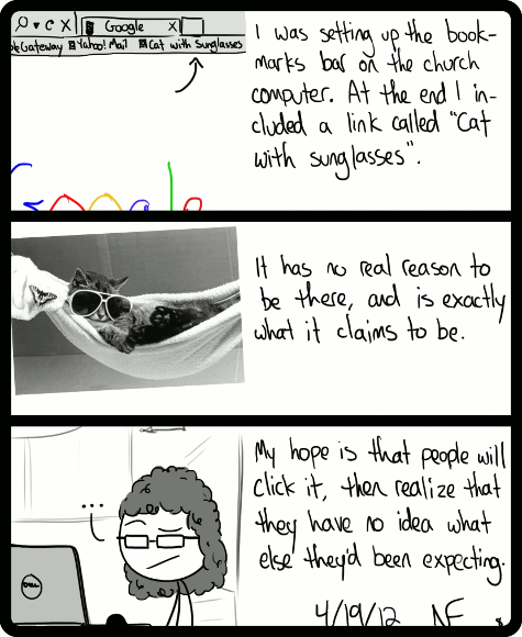
What It Says On The Tin
The Great Teacher
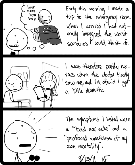
Pessimism
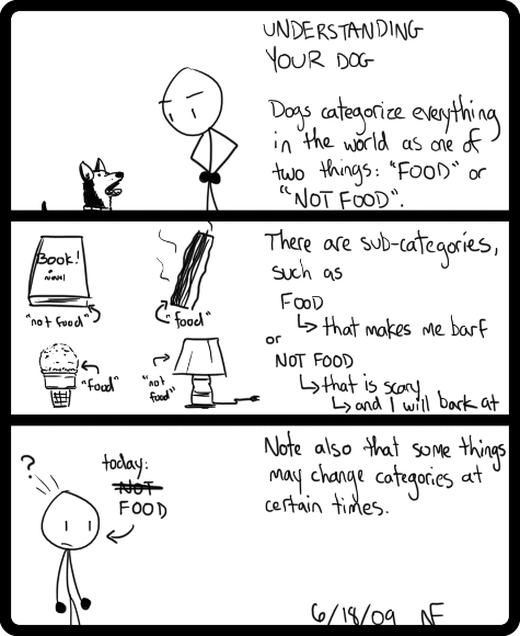
this worldview may not be exclusive to dogs
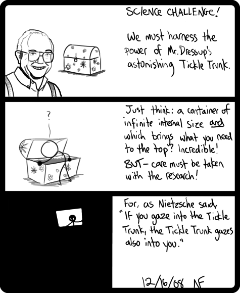
Dr. Ernie Coombs, Theoretical Physicist?
some days you should seriously never borrow n64 games to
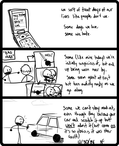
Ugh. The 2nd panel is the most confusing thing ever, now that I look at it. Why couldn’t I arrange it into panels that actually flow? Also, it looks ridiculous for a stick person to get stabbed; why am I trying to crowd a confusing image like that into a tiny panel? These are BAD CHOICES. On top of all that, I could have gotten an eight-year-old to draw the car in the last panel. I guess what I am trying to say is that this is not my favourite comic ever. [February 13, 2012]


