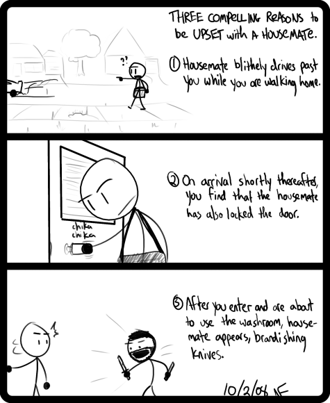
This story is completely true. It was the end of a long day, so when Kurt leapt off the stairs to confront me with his weapons (shouting “Haaaa!”) I just stood there for a moment trying to find the words to adequately convey how much of a terrible friend he was being without even really knowing it. [May 16, 2012]
Category: annoyance
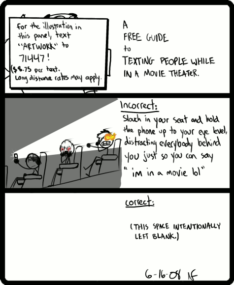
protip – the entire story is told in the trailer
you paid a lot of money for that movie ticket, now make the most of it
I’m takin’ a stand!
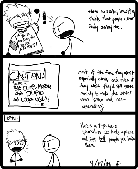
There’s a tiny logo in the lower right of the 2nd panel artwork which is supposed to be that of Walking Time Bomb. It’s a little alarm clock with legs and dynamite strapped to its back. WTB was a company that specialized in the kinds of sarcastic, wacky nonsense that this comic is talking about. Loads of places carried WTB shirts when I was in high school, and loads of people wore them too. Ridiculous things that tricked you into looking at them and often made fun of you for doing so.
I myself owned two; one which said “Slacker” and was designed to resemble the Snickers candy bar logo, which I actually quite liked, and another (the disowned) one which said “YES, it DOES hurt when I smile.” In my defense, neither of these was particularly confrontational. [February 9, 2012]
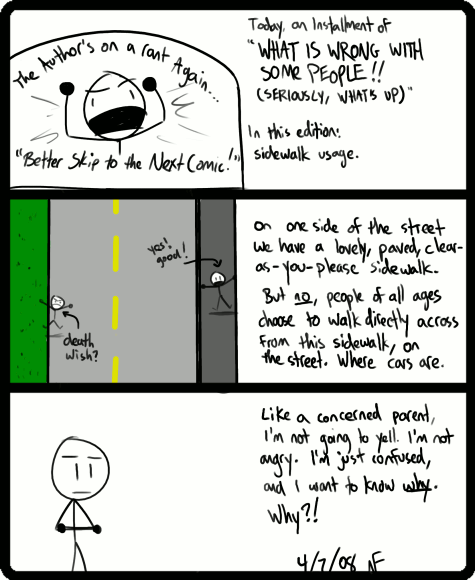
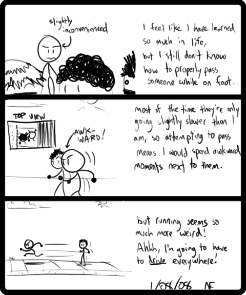
taxpayers have these sidewalks built for a reason
this has bothered me for years
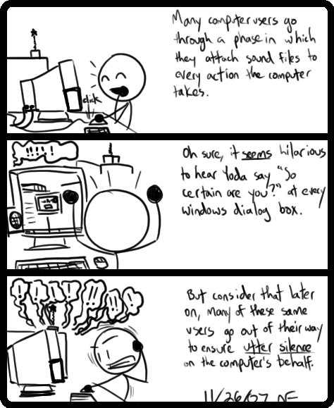
eventually, "no sound" edges out "robots" as the preferred sound scheme
just…let me have this, please
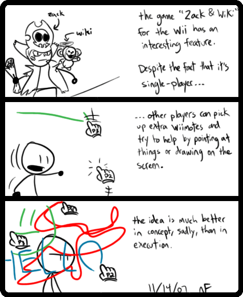
wii owners who do not have this game yet: why
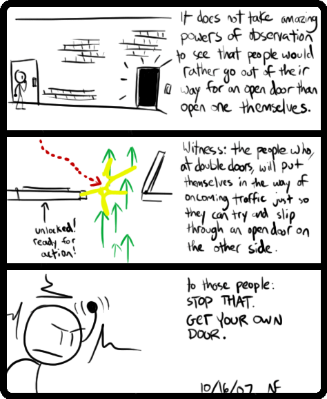
perfectly good door! right there! waiting for you!
I foolishly thought that this was the debut of the brick-pattern trick in the first panel, but on further researching I found it goes all the way back to #178. What I came to learn is that it’s entirely possible to give texture to a surface you’re drawing by simply doing bits and pieces of that texture here and there, then letting the brain fill in the rest. That way I can have, for instance, a brick wall without having to draw each brick. It’s hugely time-saving and it gives some variety to comics that are otherwise set in a vague, abstract whiteness. (Like most of the first year.)
I’m fairly certain I learned this from the work of Mike Mignola, who is like this black-belt-level-40 Master of Texture. That guy throws down a line and a couple of dots and hey presto, it’s an ancient, rough-hewn stone wall. [November 16, 2011]


